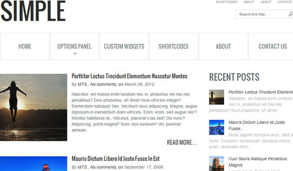
Businesses looking to start a website may want to hold off on all the extras as a recent eCommerce study revealed that minimalist designs are more profitable in many industries. The news demonstrates a desire by individuals to de-clutter their online shopping experience.
Minimalist designs offer users a more targeted message which can lead to better consumer response. These websites provide a refreshing presentation that allows your users to slow down and enjoy the shopping experience.
Focus on Key Selling Points
As an eCommerce provider, a minimalist website design allows you to better focus on key selling points. Be sure to utilize lightweight text and simple navigation to enable your visitors to effortlessly make purchases. Additionally, the approach enables you to create a clear call-to-action.
No Unnecessary Content
Your website should be clean and clear of unnecessary content. This strategy allows you to better engage visitors. Consequently, your users are more likely to engage in the conversation when they don’t feel smothered by your products.

Minimalist Website Template
No Distractions – Minimalist
The goal is to create a concise webpage free of all distractions. All important content needs to be brought to the foreground. Additionally, you want to remove any non-crucial elements from your pages. This strategy should pour over into your content creation as well. Basically, you must try to convey your message in a concise manner. Don’t be too wordy.
Traffic Flow
Always consider how your users flow through your website. Use a simplistic and logical navigation layout. Since the majority of web surfing occurs on mobile devices, you want to minimize taps. Advanced search tools are a great way to make finding items easier.
Minimalist Product Display
One of the best ways to up your online sales is to ditch the product photos. A shirt floating on a white background does little to invoke an emotional response from your visitors. Instead, add context photos that show your products in action. In this manner, your visitors better envision your products making them happy.
Minimalist Typography
The way your words appear on screen says a lot about your message. Be sure to use fun styles whenever you want to add to the excitement. Reversely, use dramatic typography to hammer home your core message.
Alignment
Your webpage alignment is also important. Your text and images should be arranged in a rectangular box-shaped manner. This is the easiest for the eyes to follow and provides the most professional impression to your visitor.
Color Contrast
Importantly, the colors your website employs set the mood for your visitors. Bright colors are exciting but should be used sparingly because they tire the eyes out. A white background is the most common and is one of the best minimalistic options to consider. For those opposed to a white background, test colors against each other to see the results, just don’t forget to test the colors against your images and fonts as well.
Use the Three Section Approach – Minimalist
The three-section approach is a simple but effective way to display your online products. The first section is your product details. This includes images, videos, and other interesting facts. The next section is the price. Here you layout your product pricing, discounts, payment plans, etc. The final section is the call to action. This is where you tell your visitor to make the purchase.
Eliminate Non-Necessary Elements
Websites today are filled with non-necessary elements. For example, there is no need to have 10 social media share buttons when your only real concern is with the top four or five platforms. Facebook, Instagram, and Twitter are excellent selections to provide.
Importantly, use the tag feature to ensure that whenever your pages are shared, they reach their relevant target audience. This is a powerful strategy that enables you to grow your social media and website traffic simultaneously. Be sure to study keywords to find the best tags.
Bye-Bye Clutter
Drop the clutter and start guiding your shoppers more effectively. In most cases, you will find that your users appreciate the minimalistic approach over a busy webpage. Lastly, be sure to track your changes in analytics. In this manner, you can fine-tune your website into an eCommerce powerhouse.

